Let's start!
Today we'll take a look at latest version of Atlassian product - JIRA 6.0 This tool for online collaboration is well known among many of project managers, and JIRA has its fans and haters. I'm not a fun, nor hater, but I worked with previous version a lot, when managed projects in social gaming.

My teams applied JIRA as a main task manager during development. Before I started running these projects, I was familiar to groupware. I was curious in analysing existing online collaboration services: Basecamp, Acunote, RememberTheMilk, Fogbugz, Asana, because I participated in developing askcow project management tool. That's why my first acquaintance with JIRA was not so painful, in contrast to my colleagues - art and game designers.
The service was enough powerful to support managing small teams, which worked according to Scrum methodology, but lacks and disadvantages of JIRA were hard to ignore. I used this tool for online collaboration much, so how can I keep myself from review of JIRA 6.0 version?
What's new.
The graphical design of the system kept the same structure and only small changes were implemented. Sure, the screen become clearer, but the aptest novelty is "create issue" button, at last accessible in a click. This control is placed now on the redesigned header of working page. This move is absolutely sound - one excessive click for usual and very often use case is a crime against user, especially for the system of such level.
Another important change relates to list of tasks and task fields. Now you can see and manage both of them at the same time. Similar scheme was already introduced by Atlassian earlier in Grasshoper chargeable plug-in, elaborated for Scrum project running, so in JIRA 6.0 this piece of functionality is a long-awaited improvement. In addition, in contrast to Grasshopper extension, now it is possible to edit all task features without opening this task separately - that's nice and makes dealing with issues faster and more comfortable.
You can also change the width of fields, where list of task and task itself are presented. Maybe some JIRA users find this useful, but I'm not. The problems begin when someone describes an issue applying text with structure, trying to emphasize some statements or grouping them. This task assignee will hardly get the point when he'll face this text shifted due another width of task field - bone and even unreadable texts hurt people a lot.
I'd give a tip to JIRA interface engineers, you'd better deal here with irrational empty and non-informative area in the upper part of the screen, seriously. Why do I need to see irrelevant and rare used controls there?
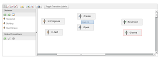
Another important improvement, which matters for me, is a possibility of editing currently active workflows. This part of JIRA functionality was always one of my favorite features, and I always applied adjustable workflows in my work, despite rough and painful related use cases. Unfortunately, the process of workflow customization still remains unclear, and this is its main disadvantage. Alas for me and other users, JIRA developers didn't concentrate their efforts on this issue.
New design for mobile devices is an important area for improvement, everyone goes for mobile, you know, but previous JIRA version was enough comfortable for me and my tablet for dealing with daily scrums and sprint plannings. Along with a board, of course.
As for JIRA disadvantages, the most serious of them remain unfixed.
What was expected.
First, and this gap is the most critical, you have to constantly press F5 and reload the page of your browser in order to see updates in lists and tasks. In addition, switching between the services pages leads to reloading of your browser page. Where's javascript, may I ask? This is an annoying and time-wasting problem, especially, when you worked in Wrike or askcow at least once. The work become dynamic, when you see your project living in your browser, when new tasks and updates in old ones appear at once and you haven't to push F5 constantly. How many important issues were missed by my collaborators due this problem! It is a disastrous drawback, and that's why I gave up using JIRA.

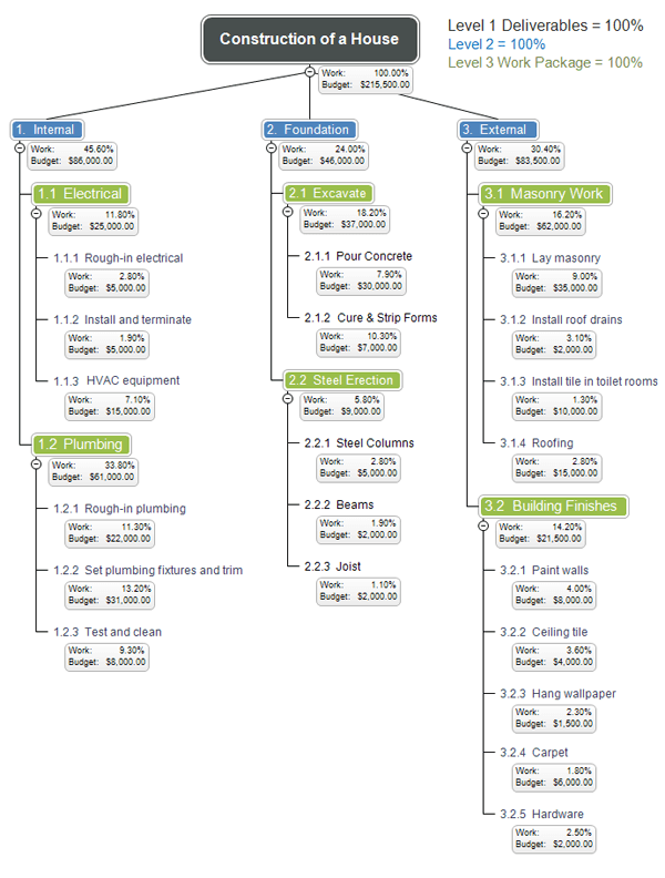
Another important disadvantage of JIRA tool is a simplicity of issues you can manage, and the point, of course, is in absence of tree of tasks. You can say that bug-tracker doesn't need this feature, but this is a very arguable issue. Any project manager wants to see the structure of the project he is running, and full-fledged tree of tasks is a must for project management tool. This also relates to Basecamp, Asana and Trello, for example. Why do I need tags, instead of usual search? Look at Wrike, look at askcow!
Third. I don't like interfering using cases and controls. All this remain in JIRA. I want to know about the shortest scenario for reaching the issue I'm currently interesting in, not two or three. I don't need two or three controls designed for the same purpose scattered along the screen. Structure of JIRA interface remains Achilless' heel of this service - it confuses people, and constant time wasting explanation is the only solution, especially when you collaborate with non-engineers.
Move along, citizens, that's nothing to see here.
Resuming this brief review, I can firmly say, that JIRA remains the same for a ordinary user. It definitely didn't become clearer, only a bit faster, thanks to integrated tasks and lists of them. The direction in which JIRA developers move is correct in general, but main problems of this tool for online collaboration - lack of project structure and of interactivity - remain unresolved.
Anyway, JIRA is good enough to prefer it to Asana or Basecamp, especially if you're experienced, but Wrike and askcow continue to remain the most advanced tools for agile project management at the moment.
You can read more about JIRA 6.0 on developers blog or here, if you're looking for details.
 PS
PS. Attention! Sarcasm warning! I want to congratulate JIRA developers on introducing long awaited possibility to change user name. At least you've done it, fellows! Ten years later.


+(1).png)
